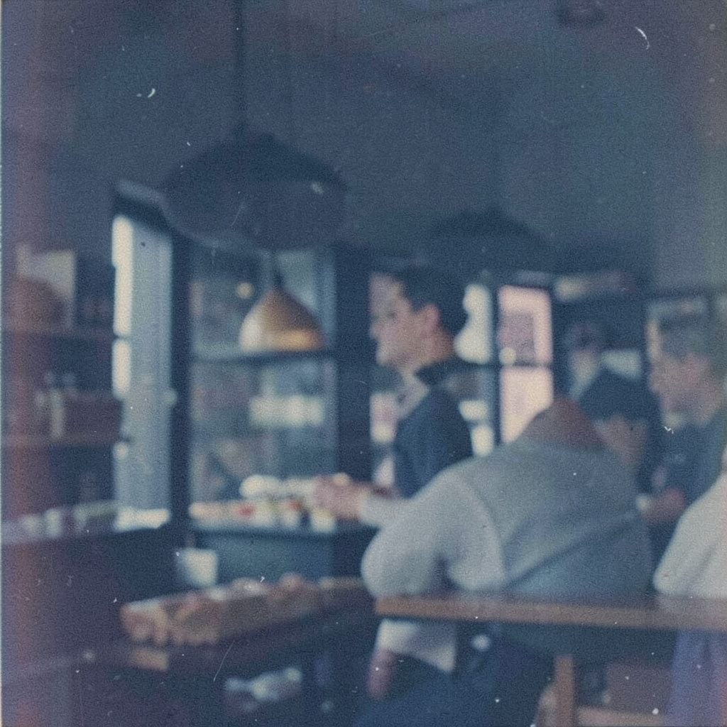
The Restaurant
Béni is a dining establishment situated at T2-19, Genting Highlands, 69000 Genting Highlands, Pahang, operated by Béni Michelin Sdn. Bhd. (Registration No: 1318959-D). The site presents the restaurant's dining room, its food gallery, and details for guests planning a visit.
Pages across the site cover the restaurant itself, a gallery of dishes, background on the Béni name, corporate event hosting, and a reservation form, alongside news updates and contact details for enquiries.
Restaurant Béni is presented as a formal dining destination whose online presence mirrors the quiet dignity of a traditional establishment. The homepage frames the restaurant with deep navy panels and gradient steel-blue banners, while serif headings lend a measured, almost editorial tone. Visitors are invited to explore the dining room, the food gallery, and the story behind the name, all set within a structured layout that favours clarity over flourish. The result is a site that reads less like marketing and more like an introduction, offering a calm first impression that suits a setting where considered hospitality matters more than bright visuals or loud calls to action throughout the experience.
Within the site, the dining room section offers a closer look at the space itself, presenting the room as part of the overall offering rather than mere backdrop. The accompanying image is treated simply, with a thin border and no shadow, allowing the visual to sit comfortably within the surrounding copy. The description of the room is restrained, letting the photograph and the understated typography do much of the work. By avoiding decorative effects, the page keeps attention on the atmosphere of the room, suggesting a place where the setting, the service, and the meal are meant to be experienced together as a single, cohesive event rather than as separate selling points.
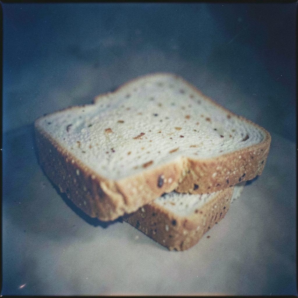
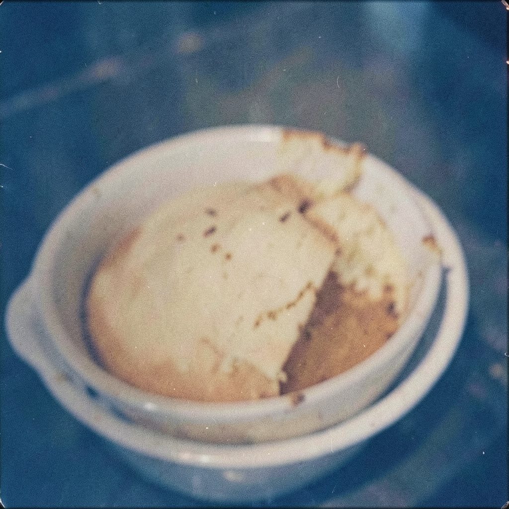
The food gallery extends this approach to the cuisine, gathering images of dishes into a single, easy-to-navigate section. Because the layout relies on plain rectangles and tight spacing, the photographs stand out through contrast rather than through elaborate presentation. Visitors can move through the gallery at their own pace, examining each dish in turn without distraction from ornamental graphics or animated elements. The narrow columns and small margins give the page a printed-menu feel, which suits a restaurant that takes its food seriously. The gallery thus functions as both a visual menu and a quiet statement of intent, signalling that the kitchen's confidence rests in the plates themselves.
An entire section of the site is dedicated to explaining the background of the restaurant, offering readers a sense of the history and philosophy that shape the operation. Written in the same measured prose that runs throughout the site, this part of the journey treats the story as a continuation of the dining experience. Rather than a quick corporate summary, the narrative unfolds in short, careful paragraphs, inviting visitors to read at length. The serif headings introduce each segment of the story with a formal weight, while the sans-serif body keeps the reading light and accessible. The page reads like a short essay rather than a brochure, which fits the overall tone.
For guests considering larger gatherings, the site includes information on corporate event hosting, outlining how the restaurant accommodates groups beyond ordinary dinner service. The presentation is straightforward, with no glossy promises or embellished descriptions, simply a calm explanation of what the venue can offer. The gradient banner that introduces this section echoes the header treatment used elsewhere, keeping the visual language consistent. Because the page avoids visual noise, prospective hosts can focus on the practical aspects of arranging an event. This restraint reflects a broader confidence in the product, suggesting that the restaurant prefers to let its service and its setting speak for themselves when welcoming parties of various sizes.
A reservation form is provided for visitors ready to plan their visit, integrated into the site in keeping with the overall static-page aesthetic. The form sits within the same narrow columns and plain typography used for editorial content, with sharp-edged fields rather than rounded inputs. There is no elaborate step-by-step wizard or animated confirmation, just a direct, practical interface. The accompanying copy is brief, offering only the information needed to complete a booking. By keeping the experience simple, the site reduces friction at the moment of decision, which is a thoughtful design choice for a destination restaurant whose guests often travel with intention rather than on impulse.
News updates appear as another layer of the site, keeping regular visitors informed about changes, seasonal offerings, or upcoming events. Because the page design favours text and image over motion, updates are presented as written entries rather than as dated banners or pop-up alerts. The format encourages reading, and the consistent typography makes recent and older items feel like parts of the same continuing record. The dark navy footer that closes the page gives the news section a stable visual ending, framing the content above it as part of an ongoing conversation between the restaurant and the guests who follow its progress over time.
Finally, contact information is offered for general enquiries, presented in the same composed manner that defines the rest of the site. There is no chat widget or floating button, only a clear, static page that respects the visitor's pace. The overall design language, from the muted blues to the small-caps serif headings and the dense, narrow columns, reinforces a sense of formality and tradition. It is a visual identity that suits an establishment whose name suggests heritage and whose setting implies a destination rather than a casual stop. Taken as a whole, the site feels like a printed house programme translated into web form.
Food Gallery
A visual record of dishes prepared and served at Béni, showing the presentation and styling of the restaurant's table settings.
The News
Update from Béni.
Update from Béni.
Further news items from Béni can be found on the News page.
About Béni
Background on the Béni name and its identity, operated under Béni Michelin Sdn. Bhd. Further details on the brand's history are presented on the About page.
Corporate Events
Béni can be approached for corporate gatherings and private functions. For event enquiries, contact the restaurant directly using the details below.
Contact & Reservations
| Address | T2-19, Genting Highlands, 69000 Genting Highlands, Pahang |
|---|---|
| Phone | (60)3-2698 2255 |
| info@beni-my.com |
A reservation form is available on the Reserve page, or you may call ahead to secure a table.